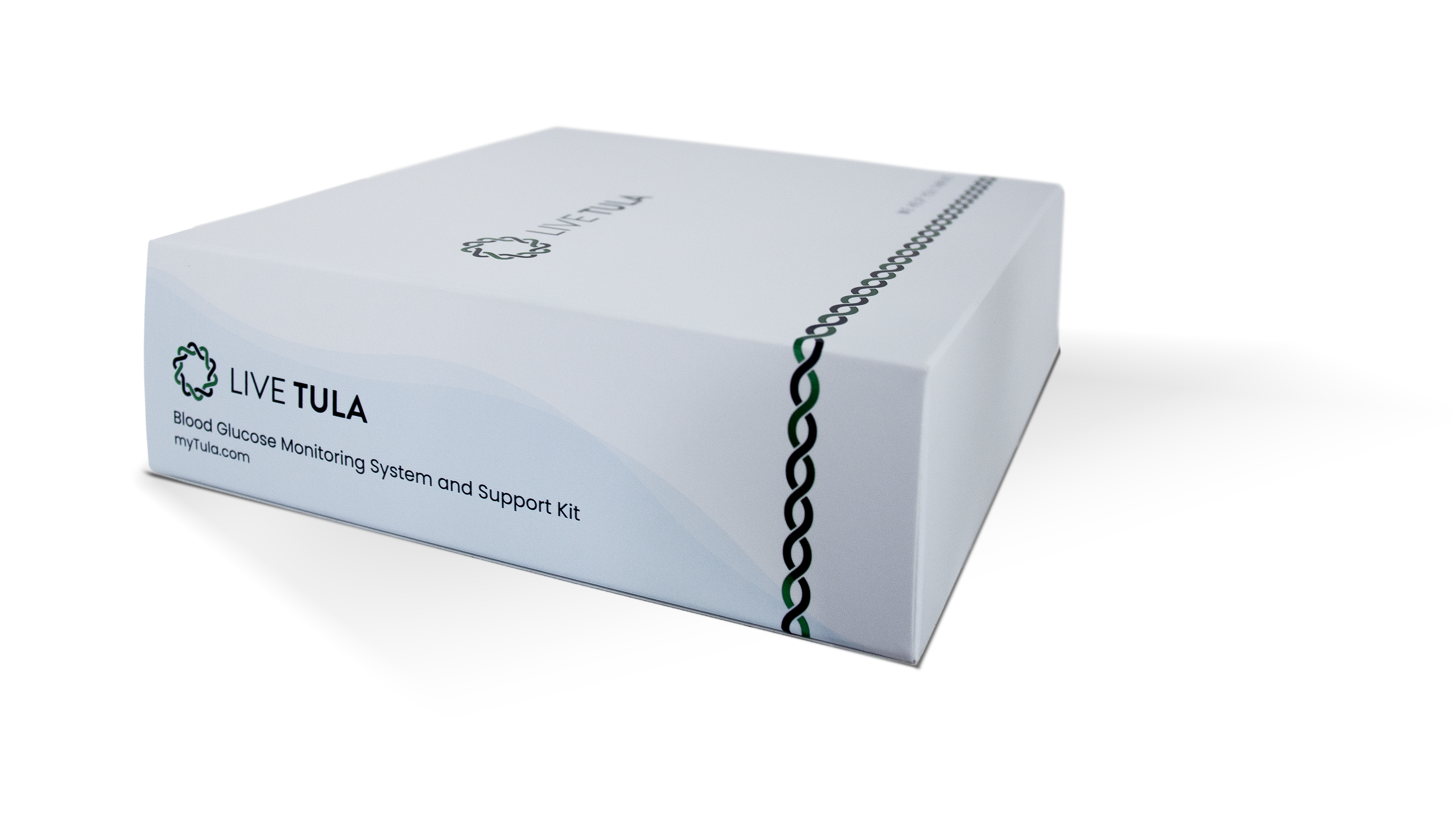
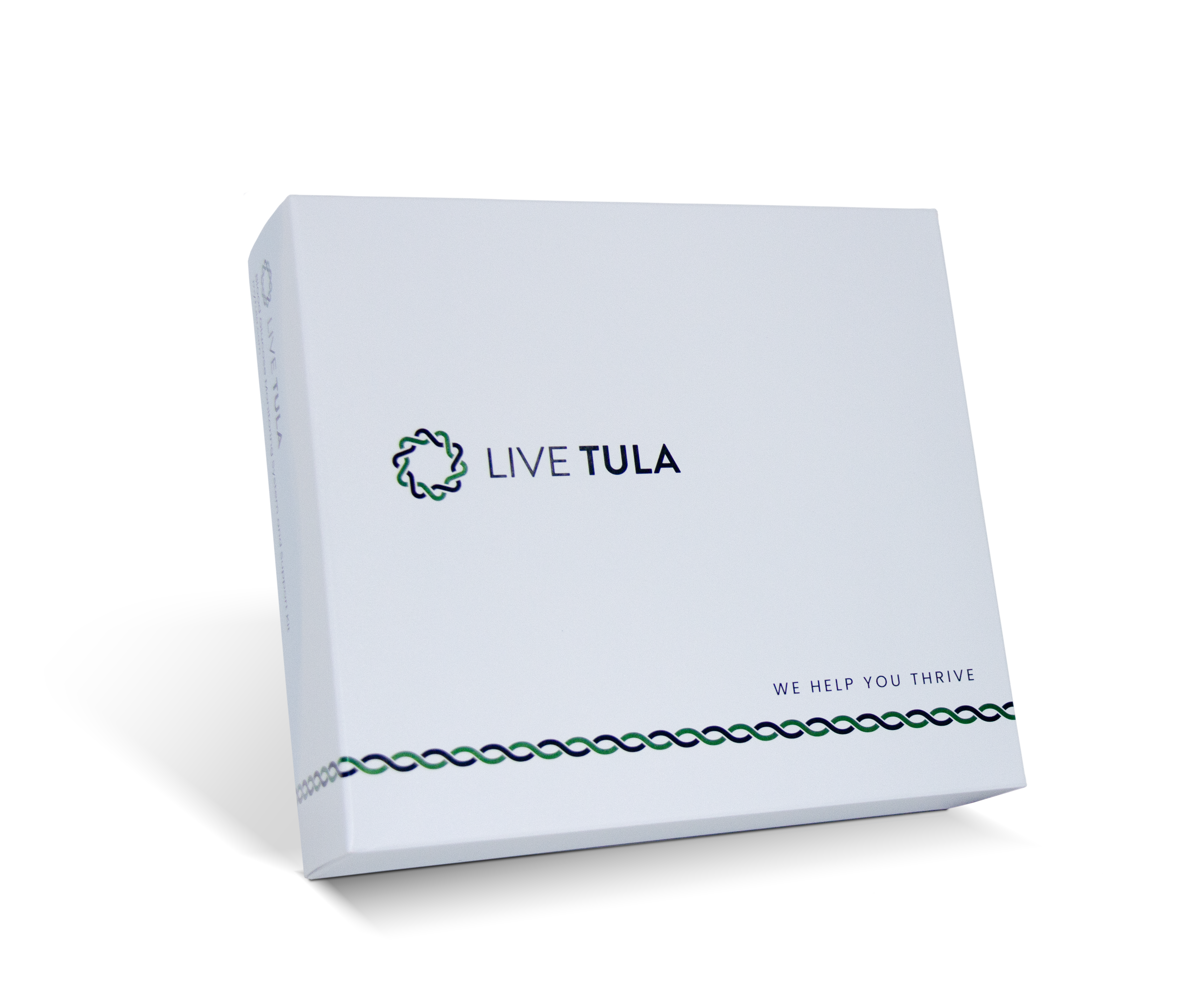
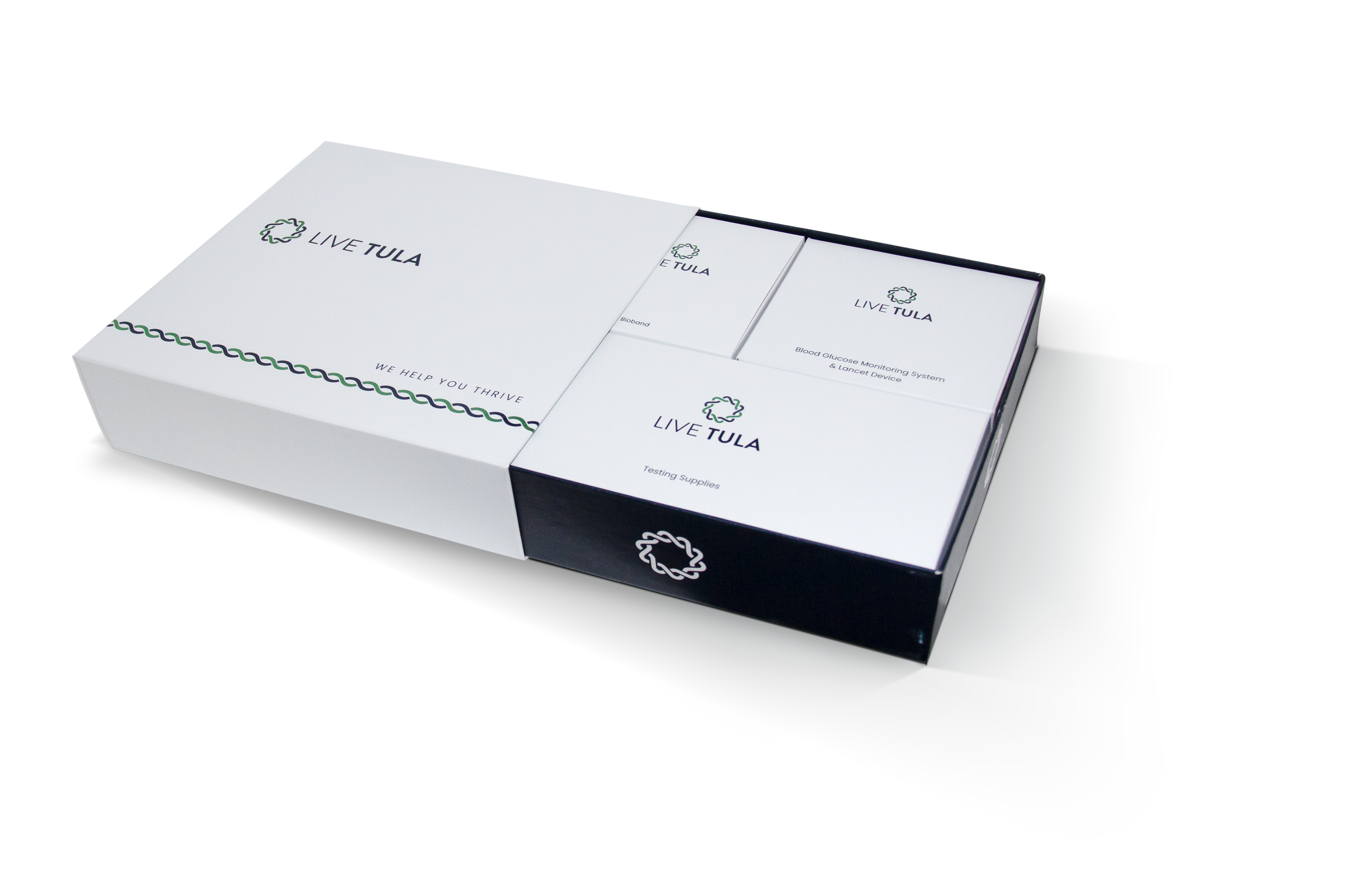
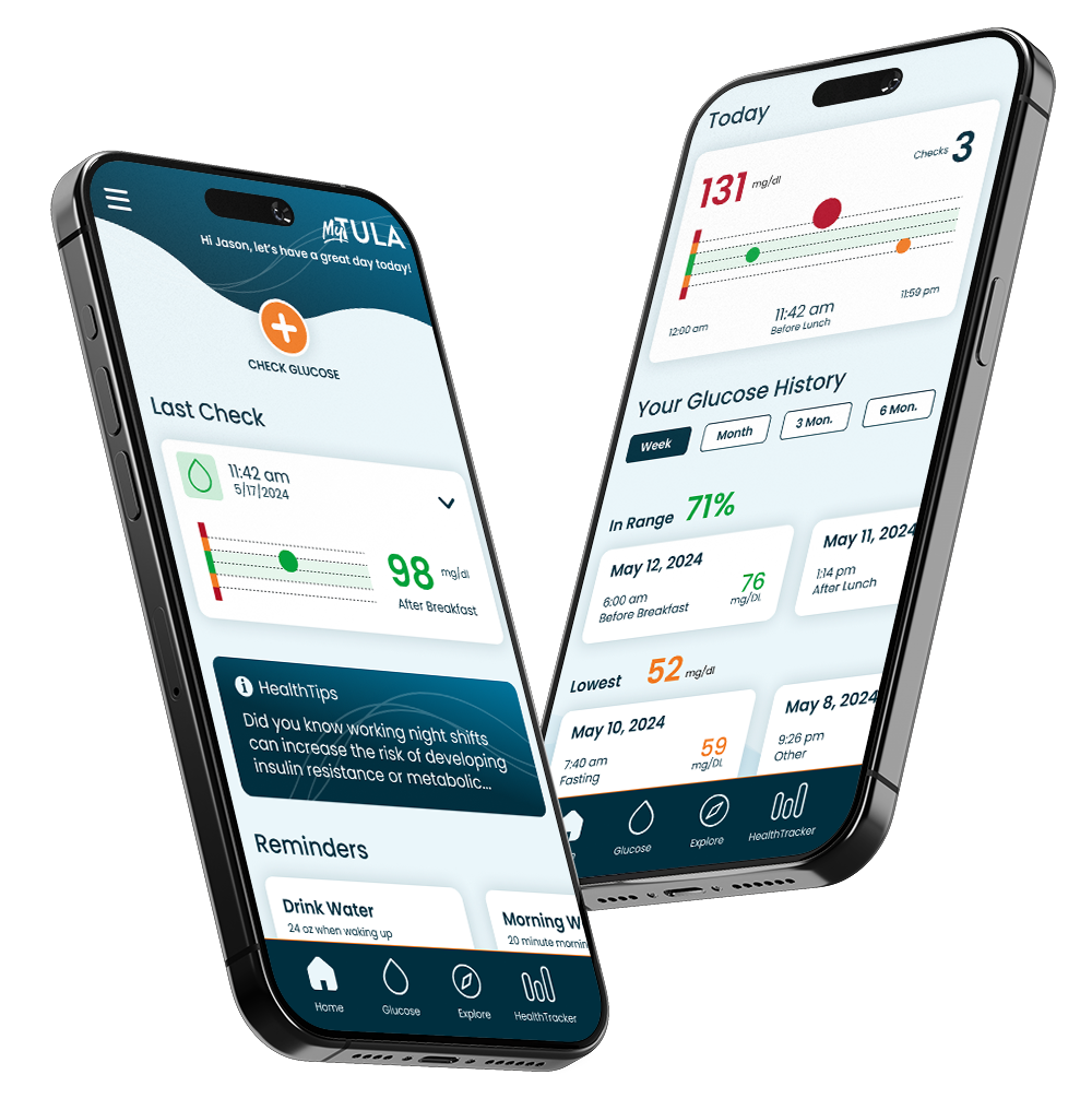
LIVE TULA
Brand Direction and Guidelines

Brand Direction and Guidelines
The Symbol
The LIVE TULA emblem serves as a symbol of optimism for individuals affected by diabetes. The fusion of two 5-point stars signifies that the LIVE TULA program functions as a guiding North Star, providing direction and support in the lives of its members. The two stars braided together create a unified 10-point star, representing the Tula 10 Principles. The emblem’s display of strength through a braided, consistent pattern assures our members and others that our program is intricately designed to contribute to their health and success. This is achieved through the collaborative efforts of our team, which includes dietitians, coaches, nurses, and compassionate human touch support. LIVE TULA’s purpose is to build a health culture where personal and nurturing education is encircled through the lives of our members as we create a lasting positive change in the diabetes community.
The Wordmark
The LIVE TULA wordmark symbolizes a robust foundation of strength and hope. Its clean lines, sharp angles, and weight contrast contribute to a stylish appearance that embodies the company’s name, signifying unwavering support throughout one’s journey with diabetes. While the wordmark can serve as a standalone symbol for LIVE TULA, it also complements the overall logo and brand design.

Color Pallet
LIVE TULA Font
When writing and referring to our company, the standard and approved format is LIVE TULA in all caps. The LIVE TULA font is based on the Google font “Poppins.” The font is clean, modern, and simple to read, reflecting the diversity of our members. All member-facing materials and communications will use this approved font and style. See below for usage and approved styling.
Headlines
Poppins Semibold
Sub Headlines
POPPINS REGULAR
(ALL CAPS)
Section Headlines
Poppins Bold
Paragraph text
Poppins Regular
Always use the LIVE TULA Navy Blue, except for on a dark background
Image Library


